 |
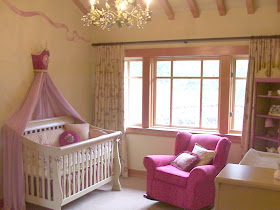
Confection colors and our studio created crowns add whimsy
in the made-over shared bedroom. |
When inspiration hits, I like to grab a sheet of blank paper and jot down ideas, scribble my thoughts in picture form and transform it into a brainstormed blueprint to elaborate on. When I asked for submissions from my Facebook page fans for rooms that need makeovers, I was struck by this room and couldn't resist the proverbial blank slate's allure.
 |
| A floating door and overwhelming pale walls. |
 |
| The good sized room was divided ineffectively. |
 |
| Eclectic furniture of varied scale. |
The homeowner, Tara said in her email to me, submitting her two daughter's shared bedroom, that they had purchased some chandeliers and their placement presented a problem. While I would have gladly offered help in placing light fixtures, the room pictures cried out for more.
When discussing the rooms potential with her, I found out that there were three assorted sized crawl-space access doors within the room. You can see them in the pictures, one floating on the wall in the corner, a second hidden behind the toybox and the third covered by the crib's side panel. These three eyesore doors added intrigue and a level of difficulty to the project that had my mind racing for ideas.
Unlike our
previous makeover project for Nick, which focused on handyman skills and built on site custom aspects to transform, I wanted to confine this room to crafts, paint and light budget solutions. These type of solutions are easily adapted and may serve as inspiration to others.
So, after an interview of the girl's likes and dislikes and a survey of the rooms furniture, bedding and existing items, I embarked upon my ideas. The girl's bedding which was from Ikea featured animals celebrating in merriment with musical instruments, juggling, riding bikes and carrying birthday cakes. This was my launching point for creating a confection colored room that had a celebratory tone to it.
 |
| The bedding offered fun and inspiration. |
While, I restricted my own participation to simple affordable ideas, I did ask Tara to sell her youngest daughter's outgrown crib and replace it with the exact Ikea bed her oldest sleeps in. This would give us some continuity in the room and help expand upon black as an accent color. Other than a few accessories, paint and craft items everything in the room was either reused, altered or edited.
 |
| 2 gallons and 3 quarts transforms the room. |
Considering the room was two square shapes overlapping, it presented itself as a candidate for some color carving, with wall of different confection flavors, as illustrated in my layout concept below.
Here are side by side room shots presenting the before and after photos.
Addressing the issues that we agreed the room had, I presented my solutions-
The Crawl-space doors- The floating one would be disguised by painting the door trim and adding a ribbon board facade. The only technical issue was guaranteeing the door and door knob functioned. The other two doors would be primed and painted to match the walls. Any pattern would continue right over the doors as if they weren't there. This basically camouflages them.
Shared Space solutions- Considering the room was shared by sisters two and half years apart, I decided to separate their sleeping areas into the two natural room halves. Our custom studio crowns would personalize each half.
Function- The dresser and dresser hutch combination dwarfed the wrought iron Ikea beds. To de-emphasis the scale difference our crowns would hold draped tulle adding weight and scale to the beds. The girl's needed lighting and side tables. To stick with our light budget theme and the Ikea tradition started by the family, I sought out two lack tables and fabric shade light pendants. While I enjoy Ikea's lack table simplicity, it wouldn't do for this project so I altered them by moving the legs back and adding a scallop trim.
Personality- Adding color, pattern and some whimsical features transformed the plain room. In the studio I created the ribbon boards, the bird sculptures and the bunting pennants to add dimension and a low cost but customized touch.
While money can be thrown into any project to purchase style and whimsy, I offer this room as a testament to sweat equity and creativity. The rooms walls are works of tape, small rollers and a level. The scalloped crown trim is easily created using a cardboard pattern that is traced and filled in. Some details about the individual pieces are described here.

Post makeover, Tara offered " First of all, I can't believe that was how I allowed the room to look! I had no idea, sense of direction and just didn't know how to organize the room and make it cute for the girls." Commenting on her favorite feature, the dotted wall she said " I could look at that wall all day. I'm really glad that it acts as a feature wall and it's the first thing you see as you walk in." While the girls proclaim to her "They love their crowns!" adding, "They really define each of their spaces, which is important to them since they share the room and pretty much everything in it!" "Working with Aaron was such a fun experience. There were so many ideas and surprises." she said.
While makeover contests don't happen often, we are thankful and excited to offer them when we can. Be sure to join our
Facebook page, that's where all of our contests are announced.
 |
| Pennants add a sense of festivity. |
 |
| Studio made birds sculpted from foam add whimsy. |
 |
| Pom Poms and Ribbons help the room celebrate with color. |
 |
Ikea's lack table purchase on sale for $4.00 transformed by moving the
legs back and adding a hand wrought scallop trim. |


